
Data Visualization Tools


The most expensive dashboard I have ever inherited was not the ugliest one. It was the polished one — clean typography, a ROAS gauge parked in the top-left corner — built on a blended number nobody had checked. The chart was fine. The attribution underneath it was last-click wearing a nicer coat. I lead with that because if you search data visualization tools, you will surface a dozen roundups written for BI analysts, data scientists, and university librarians, and almost none for the marketer who has to turn GA4 sessions, ad spend, and a CRM export into something a client will actually read before Monday's standup. That gap is the whole reason for this guide. The best data visualization tools for marketers in 2026 are not the ones with the most chart types; they are the ones that read your marketing stack natively, price fairly for a lean team, and get a decision made. Below: a cited snapshot of where the market is heading, a way to choose by team size and budget, a marketer-first roundup with honest pricing, a dedicated free-versus-paid breakdown, a native-connector reality matrix, and one straight answer on AI.
What Are Data Visualization Tools, and Why Do Marketers Need Them?
Data visualization tools turn raw numbers into charts, dashboards, and maps so patterns are readable at a glance — which, for a marketer, means turning campaign, ad, and CRM data into something a stakeholder can act on without a statistics degree. That is the whole job. A funnel chart that shows where sign-ups leak, a cohort heatmap that shows which acquisition month still has customers alive, a GA4 traffic breakdown a client can read in ten seconds: these are the outputs. The decision that follows is the point.
Marketers need these tools for a reason a data scientist does not share. Our data lives in too many places — GA4, Google and Meta Ads, LinkedIn, HubSpot, a CRM, and, inevitably, three spreadsheets — and someone has to assemble one honest story out of six sources for a stakeholder who will never open the raw export. The job-to-be-done is fast, credible, repeatable reporting, not exploratory data science. You are not hunting for an unknown pattern in a warehouse; you are proving, on a schedule, that the spend did something.
Hold onto one distinction, because the rest of this guide leans on it: a data visualization tool draws the chart, while a full BI platform also models, governs, and warehouses the data behind it. Most marketing teams need the first far more often than the second — and most of the reporting that earns its keep in data-driven marketing is the first kind, shipped weekly.
The State of Data Visualization in 2026: A Market in Transition
Here are the numbers, because a piece about visualising data should show its own. The global market sits at roughly USD 9.04 billion in 2026 and is projected to reach USD 23.76 billion by 2033 — a 14.8% compound annual growth rate — with cloud-based tools now 57.2% of the market and North America 39.6% of it, per Sci-Tech Today's 2026 adoption data. Growing, cloud-first, North-America-heavy: nothing there will surprise you.
The number that should is the one about the people. 60% of business leaders cite data-literacy gaps and 88% call data literacy essential to everyday work, again per Sci-Tech Today. That is the real reason a marketer can no longer outsource the reporting layer: the chart has become the medium in which decisions get argued, and if you cannot make one that reads clearly, someone with worse data and a better dashboard will win the meeting. Format compounds it — teams using interactive visualisation are 28% more likely to find information faster than teams on static dashboards, which is Luzmo's polite way of saying that "static graphs are officially a thing of the past."
Now the part the vendor blogs leave out. Search demand for the head term itself is down roughly a third year over year. That is not visualisation mattering less; it is AI Overviews and embedded chat quietly absorbing the "what is a chart, show me an example" half of the old demand — the correlation is a falling search line, but the cause is a shift in where the easy answer gets served, not a shrinking need. Read it as a buying signal: pay for the connected-dashboard job AI still cannot do — pulling live GA4, ad, and CRM data on a schedule and keeping it honest — not the one-off chart it now makes for free. That distinction runs through every tool below, and through the wider craft of putting data analytics to work in marketing.

How to Choose a Data Visualization Tool (by Team Size, Budget, and Stack)
Match the tool to your team size, budget, native marketing connectors, and technical maturity — start free and lightweight, and scale to enterprise BI only when governance genuinely demands it. That sentence is the whole framework; everything else is applying it honestly.
Five criteria decide it, in rough order of how much they will actually bite. First, native connectors: which of your platforms the tool reads without an ETL step wedged in between. Second, cost per seat — where "cheap" tools stop being cheap the moment the whole team needs a login. Third, ease versus depth, the trade-off between shipping a chart today and modelling the data properly. Fourth, collaboration and client sharing, white-labelling included if you are an agency. Fifth, governance at scale: row-level security, scheduled refresh, an audit trail — which only start to matter above a certain size.
By team, it resolves cleanly. A solo marketer or freelancer wants a free, chart-first tool and nothing heavier. An agency wants shareable, white-labellable reporting it can put a client's logo on. An in-house team under fifty people is almost always best served by Looker Studio plus one good marketing connector. Only an enterprise with real governance obligations should be buying Power BI, Tableau, or Domo — and it should buy them for the governance, not the chart types.
The trap runs both ways. Teams buy enterprise BI when a free connected dashboard would have done the job, and teams cling to free tools well past the point where they needed modelling, security, and a scheduled refresh they can trust. The eight tools below are scored on exactly these criteria.
The 8 Best Data Visualization Tools for Marketers in 2026
Eight tools, scored on the five criteria above and read through a marketing lens rather than a general-BI one. Where a free tier exists, I have said so; where pricing is a phone call rather than a page, I have said that too.
1. Google Looker Studio
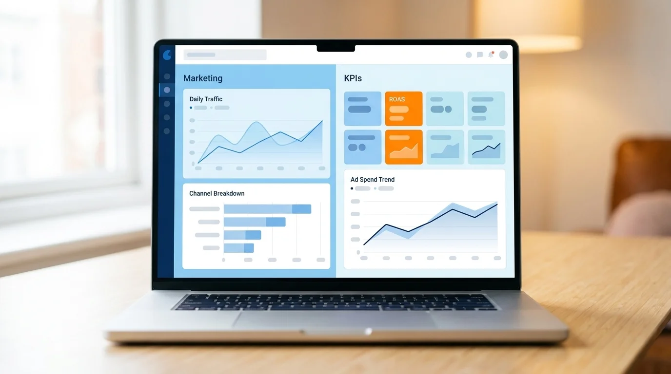
Free, and the best entry point for most marketing teams. It connects natively to Google Ads, GA4, and Search Console, which covers the bulk of a Google-heavy stack without paying anyone. Best for in-house teams under fifty and anyone whose reporting is mostly Google-shaped. The honest limitation: non-Google sources — Meta, LinkedIn, a CRM — need third-party Partner Connectors, each with its own monthly fee and its own failure point. Free until those connectors quietly add up.
2. Microsoft Power BI
The best value once you are paying for anything at all: roughly $14 per user per month for the Pro tier, with data modelling that genuinely outclasses the free tools. Best for teams that have outgrown Looker Studio and need real transformations before the chart. Its connectors reach most marketing platforms through the wider Microsoft ecosystem. The limitation is cultural as much as technical — it is Windows-centric, and the learning curve is steeper than a marketer mid-quarter usually has patience for.
3. Tableau
Still the benchmark for visual depth and polish; when the chart itself has to be beautiful and genuinely exploratory, this is the tool. Pricing starts around $15 per user per month for a Viewer seat and climbs steeply for Creator seats. Best for teams with a dedicated analyst who will actually use the depth. The limitation is plain: for a three-person marketing team that needs a weekly ROAS dashboard, the price and setup are overkill, and most of the power sits unused.
4. Domo
Named repeatedly as one of the broadest tools for native marketing connectors — Dataslayer's 2026 review puts it among the only three platforms with broad native marketing integrations. Best when you want many marketing sources unified without stitching connectors together yourself. Pricing is enterprise-tier and, frankly, opaque — you will be talking to a sales team, not reading a pricing page. That opacity is the limitation: hard to budget for, and rarely justified below real scale.
5. Klipfolio
Built for live marketing KPI dashboards — the always-on wall of numbers a team checks each morning — and another of the three cited leaders on native marketing connectors. Mid-tier pricing keeps it reachable for a growing team. Best for real-time KPI monitoring across channels. The limitation: it is optimised for dashboards, not deep ad-hoc analysis, so when you need to interrogate a strange number rather than watch a familiar one, you will feel the ceiling.
6. Datawrapper
The best tool here for chart-first, client-ready storytelling — the clean, correct, publication-grade chart you drop into a report or a deck. Its free tier is genuinely generous. Best for one-off charts a client will read and trust. The limitation is the flip side of that focus: it is not a connected live dashboard. You bring the data; it makes the chart beautifully and honestly. For scheduled multi-source reporting, it is the wrong shape.
7. Flourish
Best for interactive and animated visual stories — the scrollytelling, the animated bar-chart race, the thing that makes a stat land in a presentation. It has a free tier. Best for narrative, campaign recaps, and anything built to be watched rather than monitored. The limitation is the same species as Datawrapper's, one step further along: it is a presentation tool, not a data pipeline, so it belongs at the end of a reporting workflow, not the middle of it.
8. A Marketing-Analytics Platform (Improvado, Dataslayer, and the Like)
When native connectors run out — many ad and social sources, blended cross-channel reporting, ETL you would rather not maintain — a dedicated marketing-analytics platform earns its cost by unifying the sources before they ever reach your chart. Best for larger teams reporting across many channels at once. Pricing is higher, and that is the limitation: for a single-channel team, this is a solution to a problem you do not have. Buy it when the connector matrix below stops saying "native."
Best Free Data Visualization Tools for Marketers
For a lean marketing team, Google Looker Studio — free, with native Google Ads and GA4 connections — is the strongest starting point, with Datawrapper and Flourish alongside it for charts. That is the free stack in one sentence, and for a large share of teams it is genuinely all they need.
The pieces fit together cleanly. Looker Studio handles the connected, refreshing dashboard. Datawrapper and Flourish handle the chart-first storytelling — the asset that goes in the client deck. Google Sheets, which every marketer already has open, handles the quick chart you need in the next ten minutes. Free is genuinely enough when your reporting is single-source or Google-heavy, your team is small, and your deliverable is a client-facing chart rather than a governed data model.
Free breaks at a predictable place. The moment you need multi-source ETL, row-level security, governed access, or a scheduled refresh you can stake a client relationship on, you have crossed into paid-BI territory, and no stack of Partner Connectors will paper over it. That is not a failure of the free tools; it is them being asked to do a job they were never built for.
My honest editorial line, and it will not suit everyone: for most marketing teams under fifty people, Sheets or Looker Studio plus one marketing data connector is the highest-leverage place to start. Spend the licence budget you save on cleaning the data those charts sit on. A free chart of a clean number beats a paid chart of a dirty one every quarter.
Native Marketing-Stack Integrations: The Connector Reality Matrix
Here is the factor that should decide more tool purchases than it does: what each tool reads natively, versus what it needs a Partner Connector or a full ETL step to reach. Native means the tool pulls the data itself. Partner means a third-party connector — and its monthly fee — sits in the middle. ETL means you are moving the data yourself before the tool ever sees it. The marks below are directional, because vendors add connectors constantly, but the shape is stable enough to buy against.
| Tool | GA4 | Google Ads | Meta Ads | LinkedIn Ads | HubSpot | Generic CRM |
|---|---|---|---|---|---|---|
| Looker Studio | Native | Native | Partner | Partner | Partner | Partner |
| Power BI | Partner | Partner | Partner | Partner | Partner | ETL |
| Tableau | Partner | Partner | Partner | Partner | Partner | ETL |
| Domo | Native | Native | Native | Native | Native | Native |
| Klipfolio | Native | Native | Native | Native | Native | Partner |
| Datawrapper / Flourish | — | — | — | — | — | — |
| Improvado / Dataslayer | Native | Native | Native | Native | Native | Native |
The one sourced claim worth leaning on: Dataslayer's 2026 review found that Domo, Klipfolio, and Looker Studio (with Partner Connectors) are the only platforms with broad native marketing integrations. My reading agrees with the direction and adds one asterisk — Looker Studio's breadth is borrowed from paid Partner Connectors, so the word "native" is doing some quiet work in that third case.
Native beats ETL for a lean team for unglamorous reasons: fewer moving parts to break, no per-connector invoice, and a faster path to a live dashboard. ETL and connector platforms — Improvado, Dataslayer — earn their cost at the other end, when you are blending many ad and social sources into one cross-channel view and maintaining the pipes yourself has become the more expensive option. The question is never which tool has the most connectors. It is which of your sources it reads without you paying a toll.
AI and Natural-Language Data Visualization in 2026 (An Honest Take)
The pitch has changed. Conversational dashboards — type "show me ROAS by channel for last quarter" and get a chart back — have gone from demo to table stakes, and Luzmo argues that teams shipping dashboards without AI in 2026 "will feel outdated within months." Treat that as a description of the market's expectations, not a reason to buy on vibes.
The adoption numbers are real, and worth reading carefully. 78% of users say AI has already improved their work — genuine, not hype. But 40% still rate their own dashboards three out of five or lower, and 72% export to Excel when the dashboard falls short, also per Luzmo. Read those two together: AI has made exploration faster, and a large share of people still do not trust the dashboard enough to stop pasting into a spreadsheet. That gap is the opportunity, and it is not one more chart type.
Here is the honest division of labour. Natural-language querying and auto-summaries are genuinely good at speeding up exploration — the "what happened" question. They do not replace a connected tool that pulls live GA4, ad, and CRM data on a schedule and keeps it correct. AI describing your data is not the same as AI you can trust your data to; the second still depends entirely on the pipes underneath.
So the buyer's checklist is short. Prioritise natural-language query, auto-insights, and anomaly alerts — but only on top of reliable native connectors. AI stacked on a badly-connected dashboard just gives you the wrong answer faster, and in a more confident sentence.
The Tool Is the Cheap Part
Choosing among data visualization tools comes down to one question, not a feature comparison: which one reads your stack natively and fits your team's size and budget. For most marketing teams, that means starting free with Looker Studio plus one marketing connector, adding Datawrapper or Flourish for client-ready charts, and graduating to Power BI, Tableau, or Domo only when governance and scale actually demand it. Buy for the connected-dashboard job AI cannot do, and insist on native connectors before you are seduced by AI features.
What you can do on Monday: open your current dashboard and find the one number a decision depends on this quarter. Trace it to its source and confirm the tool is pulling it natively, not through a connector nobody is monitoring. If it is not, you have found your real problem — and it was never the chart. For more of these playbooks, the data-driven marketing category is where they live.
Frequently Asked Questions
The most-cited top five data visualization tools are Tableau, Microsoft Power BI, Google Looker Studio, Domo, and a chart-first tool like Datawrapper or Flourish. Together they span the full range, from enterprise BI with heavy modelling and governance down to free, chart-first tools a solo marketer can ship a client-ready graphic in before lunch.
ChatGPT can do basic data visualization: its data-analysis mode generates charts from files you upload, which is handy for a quick one-off look. It is not a substitute for a connected dashboard tool that pulls live GA4, ad, and CRM data on a schedule, refreshes on its own, and keeps the numbers consistent for repeatable reporting.
The difference is scope. BI platforms such as Power BI, Tableau, and Looker add data modelling, governance, and warehousing; lightweight visualization tools like Looker Studio, Datawrapper, and Flourish focus on fast, clean charts and dashboards with far less setup. Most marketing teams need the lightweight kind far more often than the heavy one.
The benefits are speed and alignment. These tools make campaign, ad, and CRM data readable at a glance, cut reporting time, and surface trends faster — teams on interactive dashboards are 28% more likely to find information quickly — while giving stakeholders one shared source of truth to argue budget decisions against instead of six conflicting spreadsheets.
The limitations are real. A poor chart choice can mislead as easily as inform, and every dashboard is only as honest as the connected data beneath it. For lean marketing teams, enterprise BI adds cost, setup, and governance overhead a free connected dashboard often avoids — so the tool can end up slower and pricier than the problem required.